The Myth of the Perfectly Matched Country Room
A perfectly matched country room can feel oddly flat. Use repeated colours, textures and shapes to make collected furniture and varied finishes feel at home.
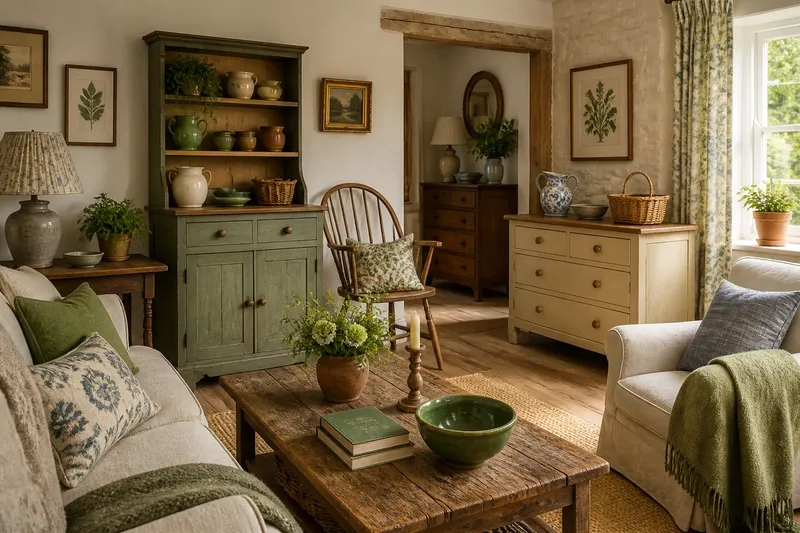
A perfectly matched country room can look strangely stiff: the oak table echoes the oak chairs, the curtains echo the cushions, and every surface seems to have arrived on the same lorry. In a rural home, where objects often gather gradually, a room can feel more settled when its parts share a few quiet cues rather than identical finishes.
Let repetition do the joining
Coherence is not the same as sameness. A room may contain painted pine, dark-stained timber and a stoneware lamp, yet still feel composed if a colour, texture or shape appears more than once. The eye recognises those returns as a thread running through the differences.
Choose a small family of cues to repeat. A muted green might turn up on a cupboard door, in a botanical print and in the glaze of a bowl. Or a rounded shape could link the curve of a chair back, a mirror and a turned wooden candlestick. The repetitions need not be exact; a close relation is often more natural.
Try naming the room’s strongest existing cue before buying anything. It may be the warm red of old brick, the silvery cast of weathered wood, or the dark line of an iron range. Let that observation guide later choices, rather than starting with a matching set.
Keep a colour thread, not a colour uniform
Country interiors often contain colours supplied by the building itself: limewashed walls, terracotta tiles, exposed stone or timber marked by years of use. Treat these as part of the palette, not as awkward details to disguise. A soft blue-grey can sit comfortably beside honey-coloured wood if a woven rug or a small painted object picks up each tone.
Use colour at different strengths. A deep shade on a substantial piece can be balanced by a faint version in a print or a little ceramic dish. This gives the eye a recognisable connection without making every item look dipped in the same paint pot.
Say you inherit a cream-painted dresser and already own a blue floral jug, while the room’s floorboards lean golden. Instead of repainting the dresser to match the jug, imagine adding a cushion with a small blue motif and a basket in a warm straw tone. The expected result is a room in which the blue and gold recur, while the dresser remains itself.
Mix materials by repeating their feel
Different materials can relate through touch and visual weight. Rough linen, brushed wool, unglazed pottery and old timber all have a softened, tactile quality. Set against a glossy surface, that shared quietness can help the room feel grounded rather than pieced together.
Look for a useful balance of surfaces. If a room already has busy wood grain, a plain wool throw or matte ceramic can give the eye somewhere to rest. If most surfaces are smooth, a rush seat, knitted cushion or hand-thrown pot can add texture without introducing another strong colour.
Do not confuse natural variation with an obligation to fill every corner with rustic materials. One rough-edged object can be enough beside a polished table; too many competing textures may make the room feel noisy. Let each material have space to register.
Use shape to link pieces from different eras
Furniture need not share a period or a finish to belong together. Look instead at outlines: a chair with a curved rail may echo the arch of a cupboard, while a square-framed print can pick up the sturdy proportions of a farmhouse table. Such links are subtle, but they stop a collection of unrelated silhouettes from pulling in every direction.
Vary the scale as well as the shape. Several small objects can look fussy when gathered together, while one larger vessel or framed picture gives them a visual anchor. A low bowl, a taller lamp and a broad-backed chair make different shapes; their shared rounded lines can still create a gentle rhythm.
Before moving furniture, notice the view from the doorway. If one side of the room feels visually heavier, a lighter-coloured or more open-shaped piece opposite it may restore balance. This is a matter of looking, not matching: a spindle-back chair can answer a solid dresser without pretending to be its twin.
Let age and patina remain visible
In a country house, finishes may carry marks of use: a rubbed edge on a painted stool, a dull patch on a brass handle, or a table top faded near the window. These signs can sit beside newer pieces without making the room feel careless. Their common quality is often a softened surface rather than a shared colour.
When bringing in something new, consider whether its finish is too pristine for the surrounding pieces. A simple, matte form may bridge old and new more gently than an ornate object designed to imitate age. Conversely, a clean-lined new chair can provide a welcome pause among carved or heavily patterned furnishings.
Keep a genuinely useful object even if its finish differs from the rest. A well-used stool or practical side table can earn its place through purpose and proportion; a small repeated colour nearby may be all the visual connection it needs.
How can a country room feel coherent without matching?
How many colours should I repeat?
There is no fixed count to follow. Start with a colour already present in the room and repeat it in a few different forms, keeping some larger surfaces quiet so the accents remain easy to notice.
Can different wood finishes work together?
Yes, particularly when their undertones or shapes have something in common. A warm timber table may sit well with a darker chair if a woven object, frame or other detail helps connect their visual weight.
What if my furniture comes from different periods?
Look for shared proportions, curves or material qualities rather than trying to disguise the differences. Repeating one colour in a modest detail can also draw the eye between pieces without making them look like a set.
How do I know when a room has enough repetition?
Stand at the entrance and notice whether your eye can travel around the room without stopping at a series of unrelated focal points. If one colour, texture or shape already appears in several places, adding more may make the pattern feel forced.
Make a small edit before buying a matching set
When a room feels unsettled, begin with a short visual audit. Remove one or two small objects from a crowded surface, then look again at the colours and materials that remain. Sometimes the room needs less competition, not a new suite of furniture.
- Identify a colour already present in the walls, floor or a favourite object.
- Notice whether timber and painted surfaces lean warm, cool or neutral.
- Choose one shape that could recur naturally, such as a curve or a square frame.
- Move a textured object nearer to a smooth surface and see whether the balance improves.
- Leave a little visual space around patterned or strongly coloured pieces.
Keep the choices that make the room easier to read and remove additions that merely repeat what is already obvious. A perfectly matched country room is not the only route to order; a few well-placed echoes can give a collected interior its own character. Let the room’s real materials lead, and use repetition as a light touch rather than a rule.